Css :before and :after
Содержание:
Комбинируем before и first-child
update 27.02.10
Как правило, на многих сайтах присутствуют «Хлебные крошки» — список, показывающий путь по сайту от его «корня» до текущей страницы. Вот как это выглядит, например на olimpic.org:
К сожалению, непосредственно на olimpic.org данный фрагмент выглядит так:
<a href="/en/" title="Home">Home</a> > <a href="/en/content/Sports/" title="Olympic Sports">Olympic Sports</a> > Volleyball
Не будем вдаваться в лишние разглагольствования по поводу молодцов, которые это верстали. Лучше разберем, как это можно сделать правильнее и красивее.
Прежде всего HTML. Это обычный список. Никаких классов для li мы, конечно, не используем, так как знаем как избавиться от дополнительного класса для первого элемента.
<ul>
<li><a href="#">Home</a></li>
<li><a href="#">Olympic Sports</a></li>
<li>Volleyball</li>
</ul>
Как вставить спецсимвол перед каждым элементом списка, это мы уже знаем:
li:before{
	content: "\3e\a0";
}

li{
	//z-index: expression(runtimeStyle.zIndex = 1, this.innerHTML = "> " + this.innerHTML) /* хак для ие6 и 7 */
}
Теперь остался последний штрих. Нужно вставить спецсимвол не всем подряд элементам списка, а всем кроме первого. Для этого воспользуемся мощной связкой before+first-child. Собственно для всех нормальных браузеров достаточно будет такой записи:
li:first-child:before{
	content:"";
}
А для особо «одаренных» (IE 6-7) придется подправить expression. В итоге CSS будет выглядеть так:
li:before{
	content:"\3e\a0"; /* вставляем маркер-скобку в браузерах понимающих before */
}

li:first-child:before{
	content:""; /* для первого элемента вставку не производим*/
}

li {
//z-index: expression(runtimeStyle.zIndex = 1, this == parentNode.firstChild ? 0 : this.innerHTML = "> " + this.innerHTML );
/* Хак для IE6-7. После загрузки документа проверяем, является ли элемент списка первым. Если да, то ничего не делаем. Иначе добавляем макрер-скобку. */
}
Данный прием подходит как для «хлебных крошек» так и, например, для различных меню.
- 6-8
- 3
- 9.5-10
- 3
- 4
CSS Reference
CSS ReferenceCSS Browser SupportCSS SelectorsCSS FunctionsCSS Reference AuralCSS Web Safe FontsCSS Font FallbacksCSS AnimatableCSS UnitsCSS PX-EM ConverterCSS ColorsCSS Color ValuesCSS Default ValuesCSS Entities
CSS Properties
align-content
align-items
align-self
all
animation
animation-delay
animation-direction
animation-duration
animation-fill-mode
animation-iteration-count
animation-name
animation-play-state
animation-timing-function
backface-visibility
background
background-attachment
background-blend-mode
background-clip
background-color
background-image
background-origin
background-position
background-repeat
background-size
border
border-bottom
border-bottom-color
border-bottom-left-radius
border-bottom-right-radius
border-bottom-style
border-bottom-width
border-collapse
border-color
border-image
border-image-outset
border-image-repeat
border-image-slice
border-image-source
border-image-width
border-left
border-left-color
border-left-style
border-left-width
border-radius
border-right
border-right-color
border-right-style
border-right-width
border-spacing
border-style
border-top
border-top-color
border-top-left-radius
border-top-right-radius
border-top-style
border-top-width
border-width
bottom
box-decoration-break
box-shadow
box-sizing
break-after
break-before
break-inside
caption-side
caret-color
@charset
clear
clip
clip-path
color
column-count
column-fill
column-gap
column-rule
column-rule-color
column-rule-style
column-rule-width
column-span
column-width
columns
content
counter-increment
counter-reset
cursor
direction
display
empty-cells
filter
flex
flex-basis
flex-direction
flex-flow
flex-grow
flex-shrink
flex-wrap
float
font
@font-face
font-family
font-feature-settings
font-kerning
font-size
font-size-adjust
font-stretch
font-style
font-variant
font-variant-caps
font-weight
gap
grid
grid-area
grid-auto-columns
grid-auto-flow
grid-auto-rows
grid-column
grid-column-end
grid-column-gap
grid-column-start
grid-gap
grid-row
grid-row-end
grid-row-gap
grid-row-start
grid-template
grid-template-areas
grid-template-columns
grid-template-rows
hanging-punctuation
height
hyphens
@import
isolation
justify-content
@keyframes
left
letter-spacing
line-height
list-style
list-style-image
list-style-position
list-style-type
margin
margin-bottom
margin-left
margin-right
margin-top
max-height
max-width
@media
min-height
min-width
mix-blend-mode
object-fit
object-position
opacity
order
outline
outline-color
outline-offset
outline-style
outline-width
overflow
overflow-x
overflow-y
padding
padding-bottom
padding-left
padding-right
padding-top
page-break-after
page-break-before
page-break-inside
perspective
perspective-origin
pointer-events
position
quotes
resize
right
row-gap
scroll-behavior
tab-size
table-layout
text-align
text-align-last
text-decoration
text-decoration-color
text-decoration-line
text-decoration-style
text-indent
text-justify
text-overflow
text-shadow
text-transform
top
transform
transform-origin
transform-style
transition
transition-delay
transition-duration
transition-property
transition-timing-function
unicode-bidi
user-select
vertical-align
visibility
white-space
width
word-break
word-spacing
word-wrap
writing-mode
z-index
How to get Mewing Results?
To start noticing Mewing Results as soon as possible, make sure you follow the steps mentioned below –
Apt Technique
It takes longer for some mewers to see results because they end up following an incorrect technique for months before they realize the problem lies.
We do not want you to land in a similar situation and hence we will break it down into simple steps that you can remember.
- Entire Tongue on the upper palate
- Molars lighting touching together
- Lips sealed
- Breath in through the nose
Nose Breathing
For some people Nasal breathing is the natural way to go, if that’s you, consider yourself lucky.
We have known many Mewers that are used to breathing through their mouth. And because they are doing so from an early age, it can be challenging at first.
Mouth Taping
This is a good alternative if you want to make sure you are breathing through your nose throughout the night while you’re asleep.
Mouth Taping also helps you sleep deeply, and have a healthier body.
We would suggest researching yourself and consulting your doctor for additional information.
Proper Swallowing
An average person swallows around 1500 to 2000 times throughout a day.
Even when we are not eating, we swallow the excess saliva inside our mouth. The correct way to swallow is to
- Close your lips
- Place your tongue on the palate (on the bumpy area right between the hard and soft palate)
- With the tip of the tongue on the roof, suck the rest of the tongue flat against the palate, slide the tongue back and swallow.
Consistency
Consistency plays a vital role in achieving Mewing Results. The lower the consistency rate the longer it will take for you to see desirable mewing results.
There is no stated amount of time for which one should maintain the Mewing tongue posture.
As they say, Mewing is a lifestyle, you have to slowly incorporate it as a habit.
So it is necessary you remind yourself time-to-time, to maintain the correct tongue posture. Set reminders, make sticky notes, and put them around your work station, or wherever you spend the most time of your day.
Posture Improvement
The second most important thing, other than maintaining a correct tongue body is – overall body posture. Mewing should be paired with an erect body posture for best Mewing results.
In simpler terms, you should make sure that your face and jaw align your chest, both with sitting and standing.
Controlling Body Fat
There is no second-guessing the fact that Mewing will not help reduce body fat. Also, if your body fat is exceeding the ideal percentage, you might want to alter your diet and lifestyle accordingly. There is a lot of research based on the ideal amount of body fat in men and women that you can read to expand your existing knowledge.
Ideal body fat will differ at different ages of your life. A healthy diet and exercising will help you lose weight and stay healthy. You may, of course, start Mewing while you go down the journey of losing body fat.
All CSS Pseudo Classes
| Selector | Example | Example description |
|---|---|---|
| :active | a:active | Selects the active link |
| :checked | input:checked | Selects every checked <input> element |
| :disabled | input:disabled | Selects every disabled <input> element |
| :empty | p:empty | Selects every <p> element that has no children |
| :enabled | input:enabled | Selects every enabled <input> element |
| :first-child | p:first-child | Selects every <p> elements that is the first child of its parent |
| :first-of-type | p:first-of-type | Selects every <p> element that is the first <p> element of its parent |
| :focus | input:focus | Selects the <input> element that has focus |
| :hover | a:hover | Selects links on mouse over |
| :in-range | input:in-range | Selects <input> elements with a value within a specified range |
| :invalid | input:invalid | Selects all <input> elements with an invalid value |
| :lang(language) | p:lang(it) | Selects every <p> element with a lang attribute value starting with «it» |
| :last-child | p:last-child | Selects every <p> elements that is the last child of its parent |
| :last-of-type | p:last-of-type | Selects every <p> element that is the last <p> element of its parent |
| :link | a:link | Selects all unvisited links |
| :not(selector) | :not(p) | Selects every element that is not a <p> element |
| :nth-child(n) | p:nth-child(2) | Selects every <p> element that is the second child of its parent |
| :nth-last-child(n) | p:nth-last-child(2) | Selects every <p> element that is the second child of its parent, counting from the last child |
| :nth-last-of-type(n) | p:nth-last-of-type(2) | Selects every <p> element that is the second <p> element of its parent, counting from the last child |
| :nth-of-type(n) | p:nth-of-type(2) | Selects every <p> element that is the second <p> element of its parent |
| :only-of-type | p:only-of-type | Selects every <p> element that is the only <p> element of its parent |
| :only-child | p:only-child | Selects every <p> element that is the only child of its parent |
| :optional | input:optional | Selects <input> elements with no «required» attribute |
| :out-of-range | input:out-of-range | Selects <input> elements with a value outside a specified range |
| :read-only | input:read-only | Selects <input> elements with a «readonly» attribute specified |
| :read-write | input:read-write | Selects <input> elements with no «readonly» attribute |
| :required | input:required | Selects <input> elements with a «required» attribute specified |
| :root | root | Selects the document’s root element |
| :target | #news:target | Selects the current active #news element (clicked on a URL containing that anchor name) |
| :valid | input:valid | Selects all <input> elements with a valid value |
| :visited | a:visited | Selects all visited links |
❮ Previous
Next ❯
CSS Properties
align-contentalign-itemsalign-selfallanimationanimation-delayanimation-directionanimation-durationanimation-fill-modeanimation-iteration-countanimation-nameanimation-play-stateanimation-timing-functionbackface-visibilitybackgroundbackground-attachmentbackground-blend-modebackground-clipbackground-colorbackground-imagebackground-originbackground-positionbackground-repeatbackground-sizeborderborder-bottomborder-bottom-colorborder-bottom-left-radiusborder-bottom-right-radiusborder-bottom-styleborder-bottom-widthborder-collapseborder-colorborder-imageborder-image-outsetborder-image-repeatborder-image-sliceborder-image-sourceborder-image-widthborder-leftborder-left-colorborder-left-styleborder-left-widthborder-radiusborder-rightborder-right-colorborder-right-styleborder-right-widthborder-spacingborder-styleborder-topborder-top-colorborder-top-left-radiusborder-top-right-radiusborder-top-styleborder-top-widthborder-widthbottombox-decoration-breakbox-shadowbox-sizingbreak-afterbreak-beforebreak-insidecaption-sidecaret-color@charsetclearclipclip-pathcolorcolumn-countcolumn-fillcolumn-gapcolumn-rulecolumn-rule-colorcolumn-rule-stylecolumn-rule-widthcolumn-spancolumn-widthcolumnscontentcounter-incrementcounter-resetcursordirectiondisplayempty-cellsfilterflexflex-basisflex-directionflex-flowflex-growflex-shrinkflex-wrapfloatfont@font-facefont-familyfont-feature-settingsfont-kerningfont-sizefont-size-adjustfont-stretchfont-stylefont-variantfont-variant-capsfont-weightgapgridgrid-areagrid-auto-columnsgrid-auto-flowgrid-auto-rowsgrid-columngrid-column-endgrid-column-gapgrid-column-startgrid-gapgrid-rowgrid-row-endgrid-row-gapgrid-row-startgrid-templategrid-template-areasgrid-template-columnsgrid-template-rowshanging-punctuationheighthyphens@importisolationjustify-content@keyframesleftletter-spacingline-heightlist-stylelist-style-imagelist-style-positionlist-style-typemarginmargin-bottommargin-leftmargin-rightmargin-topmax-heightmax-width@mediamin-heightmin-widthmix-blend-modeobject-fitobject-positionopacityorderoutlineoutline-coloroutline-offsetoutline-styleoutline-widthoverflowoverflow-xoverflow-ypaddingpadding-bottompadding-leftpadding-rightpadding-toppage-break-afterpage-break-beforepage-break-insideperspectiveperspective-originpointer-eventspositionquotesresizerightrow-gapscroll-behaviortab-sizetable-layouttext-aligntext-align-lasttext-decorationtext-decoration-colortext-decoration-linetext-decoration-styletext-indenttext-justifytext-overflowtext-shadowtext-transformtoptransformtransform-origintransform-styletransitiontransition-delaytransition-durationtransition-propertytransition-timing-functionunicode-bidiuser-selectvertical-alignvisibilitywhite-spacewidthword-breakword-spacingword-wrapwriting-modez-index
Метод 5: Псевдоэлементы с наложением цвета при наведении
Одна из последних тенденций в графическом дизайне — эффекта наложения цвета при наведении. Для этого можно использовать псевдоэлементы:
Пример
Код HTML:
<ul>
   <li>
      <img alt="Image" src="images/thumb.jpeg">
      <p>Lorem Ipsum</p>
   </li>
   <li>
     <img alt="Image" src="images/thumb.jpeg">
     <p>Lorem Ipsum</p>
   </li>
</ul>
Код li active CSS:
ul li                { width: 49%; padding: 0 5px; display: inline-block; text-align: center; position: relative;}
ul li img            { max-width: 100%; height: auto;}
ul li p              { margin: 0; padding: 20px; background: #ffffff;}
ul li::after         { height: 100%; content: ""; background: rgba(0,0,0,0.8); position: absolute; top: 0; left: 5px; right: 5px; opacity: 0;}
ul li:hover::after,
ul li:hover::before  { opacity: 1; cursor: pointer;}
ul li::before        { content: "Hover Text"; position: absolute; top: calc(50% - 12px); left: calc(50% - 40px); color: #ffffff; opacity: 0; z-index: 10;}
Результат:
hover active CSS
Данная публикация является переводом статьи «5 CSS3 TRICKS WITH PSEUDO ELEMENTS BEFORE AND AFTER» , подготовленная редакцией проекта.
CSS Advanced
CSS Rounded CornersCSS Border ImagesCSS BackgroundsCSS ColorsCSS Color KeywordsCSS Gradients
Linear Gradients
Radial Gradients
CSS Shadows
Shadow Effects
Box Shadow
CSS Text EffectsCSS Web FontsCSS 2D TransformsCSS 3D TransformsCSS TransitionsCSS AnimationsCSS TooltipsCSS Style ImagesCSS Image ReflectionCSS object-fitCSS object-positionCSS ButtonsCSS PaginationCSS Multiple ColumnsCSS User InterfaceCSS Variables
The var() Function
Overriding Variables
Variables and JavaScript
Variables in Media Queries
CSS Box SizingCSS Media QueriesCSS MQ ExamplesCSS Flexbox
CSS Flexbox
CSS Flex Container
CSS Flex Items
CSS Flex Responsive
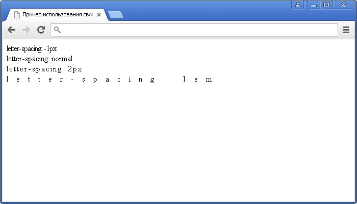
Пример использования
Изменение цвета маркера через использование CSS свойства content и псевдоэлемента :before:
<!DOCTYPE html>
<html>
<head>
<title> Пример CSS свойства content.</title>
<style>
ul {
list-style : none; /* убираем маркеры у маркированного списка */
}
li:before {/* Псевдоэлемент :before добавляет содержимое, указанное в свойстве content перед каждым элементом <li> */
content : "•"; /* вставляем содержимое, которое выглядит как маркер */
padding-right : 10px; /* устанавливаем правый внутренний отступ элемента. */
color : red; /* устанавливаем цвет шрифта */
}
</style>
</head>
	<body>
		<ul>
			<li>Элемент списка</li>
			<li>Элемент списка</li>
			<li>Элемент списка</li>
		</ul>
	</body>
</html>
Изменение цвета маркера через использование CSS свойства content.
Пример использования счетчиков в CSS через использование CSS свойств content, counter-reset, counter-increment и псевдоэлемента :before:.
<!DOCTYPE html>
<html>
<head>
<title>Пример использования счетчиков в CSS.</title>
<style>
body {
counter-reset : schetchik1; /* инициализируем счетчик №1 */
line-height : .3em; /* устанавливаем междустрочный интервал для всего документа */
}
h2 {
counter-reset : schetchik2; /* инициализируем счетчик №2 */
}
h2:before { /* Псевдоэлемент :before добавляет содержимое, указанное в свойстве content перед каждым элементом <h2> */
counter-increment : schetchik1; /* определяем инкремент для глав с шагом 1 (значение по умолчанию) */
content : "Глава № " counter(schetchik1) ". "; /* указываем, содержимое, которое будет добавлено перед каждым элементом <h2>. Значение counter определяет счетчик   */
}
h3 {
margin-left : 20px; /* устанавливаем величину отступа от левого края элемента */
}
h3:before {/* Псевдоэлемент :before добавляет содержимое, указанное в свойстве content перед каждым элементом <h3> */
counter-increment : schetchik2; /* определяем инкремент для статей с шагом 1 (значение по умолчанию) */
content : counter(schetchik1) "." counter(schetchik2) " "; /* указываем, содержимое, которое будет добавлено перед каждым элементом <h3>. Значение counter определяет счетчик   */
}
</style>
</head>
<body>
<h2>Название главы</h2>
<h3>Статья</h3>
<h3>Статья</h3>
<h3>Статья</h3>
<h2>Название главы</h2>
<h3>Статья</h3>
<h3>Статья</h3>
<h3>Статья</h3>
<h2>Название главы</h2>
<h3>Статья</h3>
<h3>Статья</h3>
<h3>Статья</h3>
</body>
</html>
Пример использования счетчиков в CSS (свойства counter-reset и counter-increment).
Выведем содержание, как значение атрибута элемента, использую псевдоэлемент :after и свойство content:
<!DOCTYPE html>
<html>
<head>
<title>Пример использования счетчиков в CSS.</title>
<style>
a:after {/* Псевдоэлемент :after добавляет содержимое, указанное в свойстве content после каждого элемента <а> */
content : ""attr(title)""; /* между всеми тегами <a></a> автоматически будет проставляться значение атрибута title */
}
</style>
</head>
<body>
<a href = "http://basicweb.ru" title = "Basicweb.ru"></a>
</body>
</html>
Пример добавления и изменения кавычек в тексте, используя CSS свойства content, quotes, а также псевдоэлементов :before и :after:
<!DOCTYPE html>
<html>
<head>
<title>Пример добавления кавычек к тексту в CSS</title>
<style>
* {
quotes : "«" "»" "‹" "›"; /* используя универсальный селектор устанавливаем тип кавычек для первого и второго уровня вложенности (для всех элементов) */
}
p:before {content : open-quote;}  /* используя псевдоэлемент :before добавляем перед элементом <p> открывающиеся кавычки */
p:after {content : close-quote;}  /* используя псевдоэлемент :after добавляем после элемента <p> закрывающиеся кавычки */
</style>
</head>
<body>
<q>Обычная цитата<q>
<q>Это <q>ЦИТАТА</q> внутри цитаты</q>
<p>Параграф, к которому, используя псевдоклассы добавлены кавычки.</p>
</body>
</html>
Пример добавления и изменения кавычек в тексте.CSS свойства
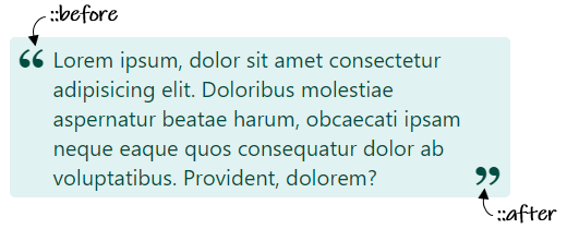
Примеры использования псевдоэлементов after и before
1. Применение CSS псевдоэлементов и для оформления цитаты.
HTML разметка цитаты:
<div class="blockquote">Текст цитаты...</div>
CSS код для оформления цитаты:
.blockquote {
  margin: 0 auto;
  max-width: 400px;
  position: relative;
  padding: 5px 32px;
  background-color: #e0f2f1;
  color: #004d40;
  border-radius: 4px;
}

.blockquote::before {
  content: '\201e';
  position: absolute;
  top: -16px;
  left: 6px;
  font-family: Georgia, serif;
  font-size: 40px;
  line-height: 1;
  font-weight: bold;
}

.blockquote::after {
  content: '\201c';
  position: absolute;
  right: 6px;
  font-family: Georgia, serif;
  font-size: 40px;
  line-height: 1;
  font-weight: bold;
}
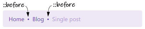
2. Пример использования псевдоэлемента для разделения элементов в хлебных крошках.
HTML структура хлебных крошек:
<ol class="breadcrumb">
  <li class="breadcrumb__item"><a href="#">Home</a></li>
  <li class="breadcrumb__item"><a href="#">Blog</a></li>
  <li class="breadcrumb__item breadcrumb__item_active" aria-current="page">Single post</li>
</ol>
CSS код хлебных крошек:
.breadcrumb {
  display: flex;
  flex-wrap: wrap;
  padding: .75rem 1rem;
  margin-bottom: 1rem;
  list-style: none;
  color: #b39ddb;
  background-color: #ede7f6;
  border-radius: .25rem;
}

.breadcrumb__item>a {
  text-decoration: none;
  color: #673ab7;
}

.breadcrumb__item>a:hover {
  text-decoration: none;
  color: #311b92;
}

.breadcrumb__item+.breadcrumb__item {
  padding-left: 8px;
}

/* добавление разделителя между элементами хлебных крошек с помощью псевдоэлемента before */
.breadcrumb__item+.breadcrumb__item::before {
  display: inline-block;
  padding-right: 8px;
  color: #673ab7;
  content: "•";
}
Изображние хлебных крошек:
3. Пример добавления hover эффекта к ссылке, оформленной с помощью background картинки, с использованием псевдоэлементов after и before.
Псевдоэлемент используется для затемнения изображения, а — для отображения картинки «Запустить».
HTML код ссылки:
<a href="#" class="image__over"></a>
CSS код с использованием after и before:
.image__over {
  position: relative;
  display: block;
  overflow: hidden;
  padding-top: 56.25%;
  background: url(buterfly.jpg) no-repeat;
  background-size: cover;
  border-radius: 4px;
}

.image__over:hover::before,
.image__over:focus::before {
  content: "";
  position: absolute;
  left: 0;
  top: 0;
  right: 0;
  bottom: 0;
  background-color: rgba(48, 53, 71, .4);
  cursor: pointer;
}

.image__over:hover::after,
.image__over:focus::after {
  content: "";
  position: absolute;
  top: 50%;
  left: 50%;
  height: 64px;
  width: 72px;
  background-image: url("data:image/svg+xml,%3Csvg xmlns='http://www.w3.org/2000/svg' viewBox='0 0 14 16' width='14' height='16'%3E%3Cpath d='M13.262 6.708l-11-6.503C1.37-.323 0 .19 0 1.495v13.003c0 1.172 1.272 1.878 2.262 1.291l11-6.5c.981-.578.984-2.003 0-2.58z' fill='%23ffffff'/%3E%3C/svg%3E");
  background-size: 72px 64px;
  background-repeat: no-repeat;
  background-position: center center;
  margin-left: -32px;
  margin-top: -36px;
  cursor: pointer;
}
4. Пример, аналогичный предыдущему, за исключением того что изображение будем задавать с помощью элемента .
HTML разметка этого примера:
<a href="#" class="image__over">
  <img src="buterfly.jpg" alt="">
</a>
CSS код:
.image__over {
  display: inline-block;
  font-size: 0;
  position: relative;
  overflow: hidden;
  border-radius: 4px;
}

.image__over>img {
  max-width: 400px;
}

.image__over:hover::before,
.image__over:focus::before {
  content: "";
  position: absolute;
  left: 0;
  top: 0;
  right: 0;
  bottom: 0;
  background-color: rgba(48, 53, 71, .4);
  cursor: pointer;
}

.image__over:hover::after,
.image__over:focus::after {
  content: "";
  position: absolute;
  top: 50%;
  left: 50%;
  height: 64px;
  width: 72px;
  background-image: url("data:image/svg+xml,%3Csvg xmlns='http://www.w3.org/2000/svg' viewBox='0 0 14 16' width='14' height='16'%3E%3Cpath d='M13.262 6.708l-11-6.503C1.37-.323 0 .19 0 1.495v13.003c0 1.172 1.272 1.878 2.262 1.291l11-6.5c.981-.578.984-2.003 0-2.58z' fill='%23ffffff'/%3E%3C/svg%3E");
  background-size: 72px 64px;
  background-repeat: no-repeat;
  background-position: center center;
  margin-left: -32px;
  margin-top: -36px;
  cursor: pointer;
}
CSS Свойства
align-contentalign-itemsalign-selfallanimationanimation-delayanimation-directionanimation-durationanimation-fill-modeanimation-iteration-countanimation-nameanimation-play-stateanimation-timing-functionbackface-visibilitybackgroundbackground-attachmentbackground-blend-modebackground-clipbackground-colorbackground-imagebackground-originbackground-positionbackground-repeatbackground-sizeborderborder-bottomborder-bottom-colorborder-bottom-left-radiusborder-bottom-right-radiusborder-bottom-styleborder-bottom-widthborder-collapseborder-colorborder-imageborder-image-outsetborder-image-repeatborder-image-sliceborder-image-sourceborder-image-widthborder-leftborder-left-colorborder-left-styleborder-left-widthborder-radiusborder-rightborder-right-colorborder-right-styleborder-right-widthborder-spacingborder-styleborder-topborder-top-colorborder-top-left-radiusborder-top-right-radiusborder-top-styleborder-top-widthborder-widthbottombox-decoration-breakbox-shadowbox-sizingcaption-sidecaret-color@charsetclearclipcolorcolumn-countcolumn-fillcolumn-gapcolumn-rulecolumn-rule-colorcolumn-rule-stylecolumn-rule-widthcolumn-spancolumn-widthcolumnscontentcounter-incrementcounter-resetcursordirectiondisplayempty-cellsfilterflexflex-basisflex-directionflex-flowflex-growflex-shrinkflex-wrapfloatfont@font-facefont-familyfont-kerningfont-sizefont-size-adjustfont-stretchfont-stylefont-variantfont-weightgridgrid-areagrid-auto-columnsgrid-auto-flowgrid-auto-rowsgrid-columngrid-column-endgrid-column-gapgrid-column-startgrid-gapgrid-rowgrid-row-endgrid-row-gapgrid-row-startgrid-templategrid-template-areasgrid-template-columnsgrid-template-rowshanging-punctuationheighthyphens@importisolationjustify-content@keyframesleftletter-spacingline-heightlist-stylelist-style-imagelist-style-positionlist-style-typemarginmargin-bottommargin-leftmargin-rightmargin-topmax-heightmax-width@mediamin-heightmin-widthmix-blend-modeobject-fitobject-positionopacityorderoutlineoutline-coloroutline-offsetoutline-styleoutline-widthoverflowoverflow-xoverflow-ypaddingpadding-bottompadding-leftpadding-rightpadding-toppage-break-afterpage-break-beforepage-break-insideperspectiveperspective-originpointer-eventspositionquotesresizerighttab-sizetable-layouttext-aligntext-align-lasttext-decorationtext-decoration-colortext-decoration-linetext-decoration-styletext-indenttext-justifytext-overflowtext-shadowtext-transformtoptransformtransform-origintransform-styletransitiontransition-delaytransition-durationtransition-propertytransition-timing-functionunicode-bidiuser-selectvertical-alignvisibilitywhite-spacewidthword-breakword-spacingword-wrapwriting-modez-index